
Tuk-Tam Rebranding
Logo
About
Tuk-Tam is Bulgarian NGO operating in education! Tuk-Tam works hard to ensure every young person in Bulgaria has their chance for success. They are creating a globally connected and supportive brain gain community of Bulgarians here and there.
Client
Tuk-Tam
tuk-tam.bg
Project
Updating the visual identity of the brand and developing of custom iconography set to support the marketing team in their communication efforts across different medias.
Services
Logo Redesign
When the old logo is geometrically inspected, it is observed that the upper and lower arcs are not centered with each other and do not fall into the absolute center of the symbol. We have recreated the logo in a geometrically correct way. We also revised the map to ensure that the thicknesses of the lines are absolutely equal across the logo. When overlaid, the differences between the old version and the new geometrically correct one can be seen.


Logo Construction
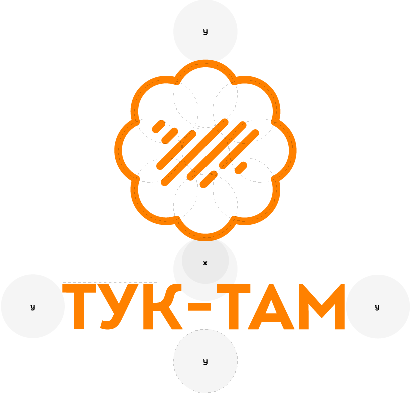
The logo symbol of Tuk-Tam is made up of 8 circles rotated at a 45-degree angle. The minimum empty space around the logo in every situation should be at least Y. The logotype is positioned at a distance X from the symbol and requires a minimum distance Y on the side and below.


Palette
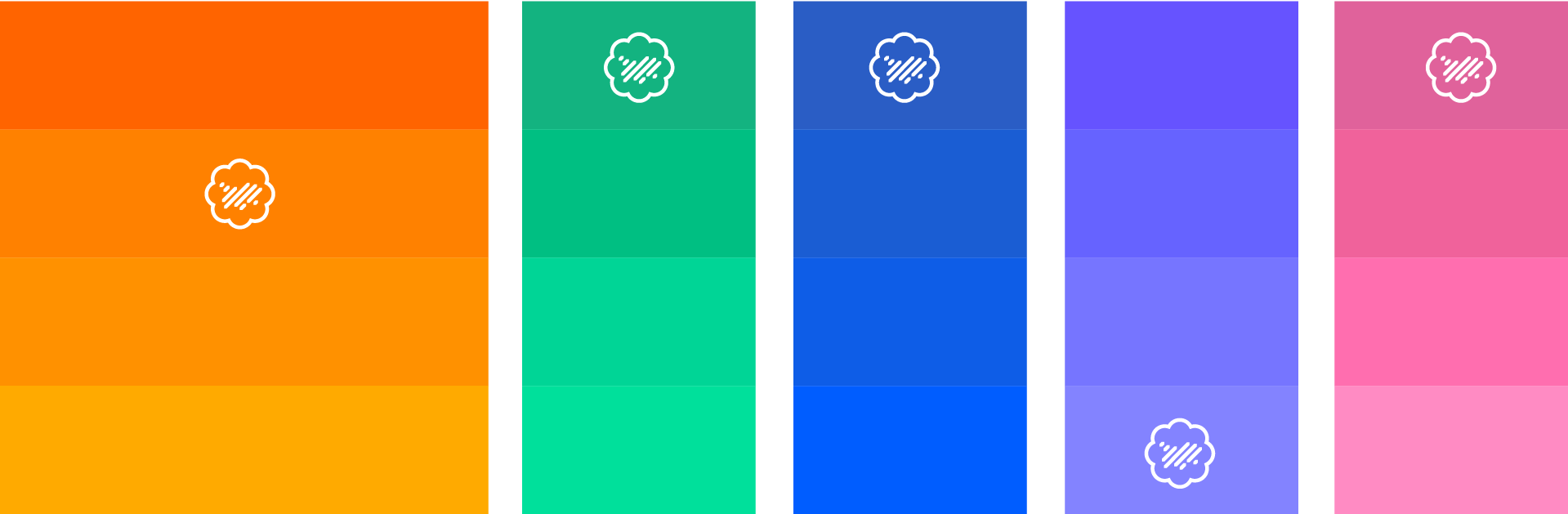
The core brand color of Tuk-Tam is bright orange. It reflects the positive attitude and optimism of the brand. It is in unison with the slogan 'The Future is Brighter'. Each of the supporting colors are chosen to support the brand in the different types of projects they execute.
Icons
We created icons for each of the three key values of the brand - Optimism, Togetherness, Transparency.
Based on this custom style we developed a complete iconography and illustration style.


Brand element & Crops
The brand element is constructed with respect to the legacy visual identity, using the overlay of multicolored variations of the logo symbol.
We combine 5 logo symbols, each in the colors of one of the Tuk-Tam projects, showing that by uniting them we achieve the wholeness and full strength of the community.
Using the full range of the palette, we create a sense of inclusiveness for all without discrimination of any kind.
In the identity, crops from the brand element are used both to direct attention to a specific part of the design and as a background.


Visual Identity


More projects
-
![]()
Villa Daros
Winery established in 2021, located in the Heart of Struma Valley.
View Case Study -
![]()
Bulgarian Angels Club
Largest private angel network in Bulgaria.
-
![]()
Amused
New-age marketing and content agency operating globally.
View Case Study -
![]()
Vodar
Supreme mental coaching app for tennis clubs working with juniors.
View Case Study -
![]()
Mission Vitosha
The initiative that is bringing the mountain back to people of Sofia.
View Case Study -
![]()
We Continue The Change
The newest widely recognized political party in Bulgaria.
View Case Study -
![]()
Tuk-Tam
A global network for support of young people in their career.
View Case Study -
![]()
Vast
The #OpenSource Metaverse platform.
View Case Study -
![]()
Bulgaria for Ukraine
Support initiative and network for Ukrainian refugees in Bulgaria.
View Case Study


