ANGEL INVESTING · COMMUNITY
bulgarian angels club
Bulgarian Angels Club brings together investors supporting Bulgaria’s next generation of entrepreneurs. The rebrand followed the transition from CEO Angels Club to Bulgarian Angels Club, reflecting a broader mission and stronger national presence.
challenge
The rebrand began with the transition from CEO Angels Club to Bulgarian Angels Club.
The existing organization had already built recognition and credibility, but the new name represented a wider mission. The identity needed to move beyond the narrower association with CEOs and create a brand capable of representing an expanding community of investors, founders, partners, and initiatives.
The challenge was to create a symbol that felt relevant to angel investing without relying on literal wings or familiar startup imagery, while introducing a subtle Bulgarian dimension without becoming folkloric or nostalgic.
approach
The identity is built around a simple visual idea: the angel as a symbol of support, guidance, and potential.
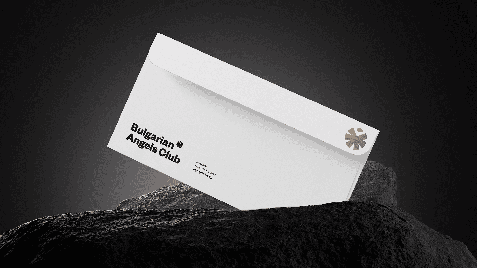
The mark reduces the figure of an angel to a bold geometric form — a head suspended above a radial body that suggests both wings and movement. Its construction is inspired by the geometry of the Pliska Rosette, introducing a quiet reference to Bulgarian history without turning the identity into a historical pastiche.
A second, much smaller reference comes from the asterisk — the tiny symbol often used to draw attention to a note in the fine print. Reinterpreted as part of the brand language, it becomes a visual signature: a small mark carrying additional meaning.
Together, these references create an emblem that feels simultaneously human, symbolic, and distinctly local.
Black and white form the foundation of the visual system, giving the brand authority and flexibility, while metallic gold introduces a sense of value, achievement, and distinction. A deep green expands the palette with a more institutional tone.
Bold typography and direct layouts keep communication energetic and contemporary, allowing the identity to move easily across events, reports, presentations, digital products, and community initiatives.
client
Bulgarian Angels Club
industry
Angel Investing · Venture Capital
Startup Ecosystem · Community
scope
Brand Strategy, Rebranding, Logo Design,
Visual Identity, Art Direction, Digital & Print Applications
credits
Desislava Sredkova by Awblak


result
The new identity gave Bulgarian Angels Club a visual language equal to its growing role in the local investment ecosystem.
The angel symbol became a recognizable shorthand for the community — distinctive enough to stand independently, yet simple enough to function across everything from business cards and reports to events, certificates, digital platforms, and social communication.
Three years later, the system continues to expand without losing its core character.
What began as a response to a name change evolved into a flexible identity for a community built around one central idea: people with experience and capital helping ambitious ideas take flight.
year
2023
links
angelsclub.bg
YOU MIGHT ALSO LIKE