PODCAST · EDUCATION · PERSONAL GROWTH
the superhuman podcast
A rebrand for one of Bulgaria’s most recognizable podcasts for personal growth, ideas, and inner transformation. Свръхчовекът is a platform built around conversations that help people grow — through ideas, discipline, resilience, and self-knowledge. The rebrand set out to preserve the spirit of the original identity while creating a mark that feels more timeless, distinctive, and symbolically rich.
Rather than depicting physical power, the new identity explores the deeper meaning of the superhuman: the person who carries invisible weight, endures inner battles, and keeps moving forward.
challenge
The original logo had strong recognition, but its visual language leaned toward a literal and overly muscular interpretation of strength. For a platform centered on mindset, growth, and human potential, it was important to move away from the feeling of a fitness emblem and toward something more universal and meaningful.
The challenge was to retain the core idea of Atlas carrying the world — and with it the familiar spirit of the brand — while making the identity more compact, cleaner, and more memorable.
It was also important for the figure not to read clearly as male or female. The superhuman is not defined by gender, but by endurance, awareness, and the ability to carry what cannot always be seen.
approach
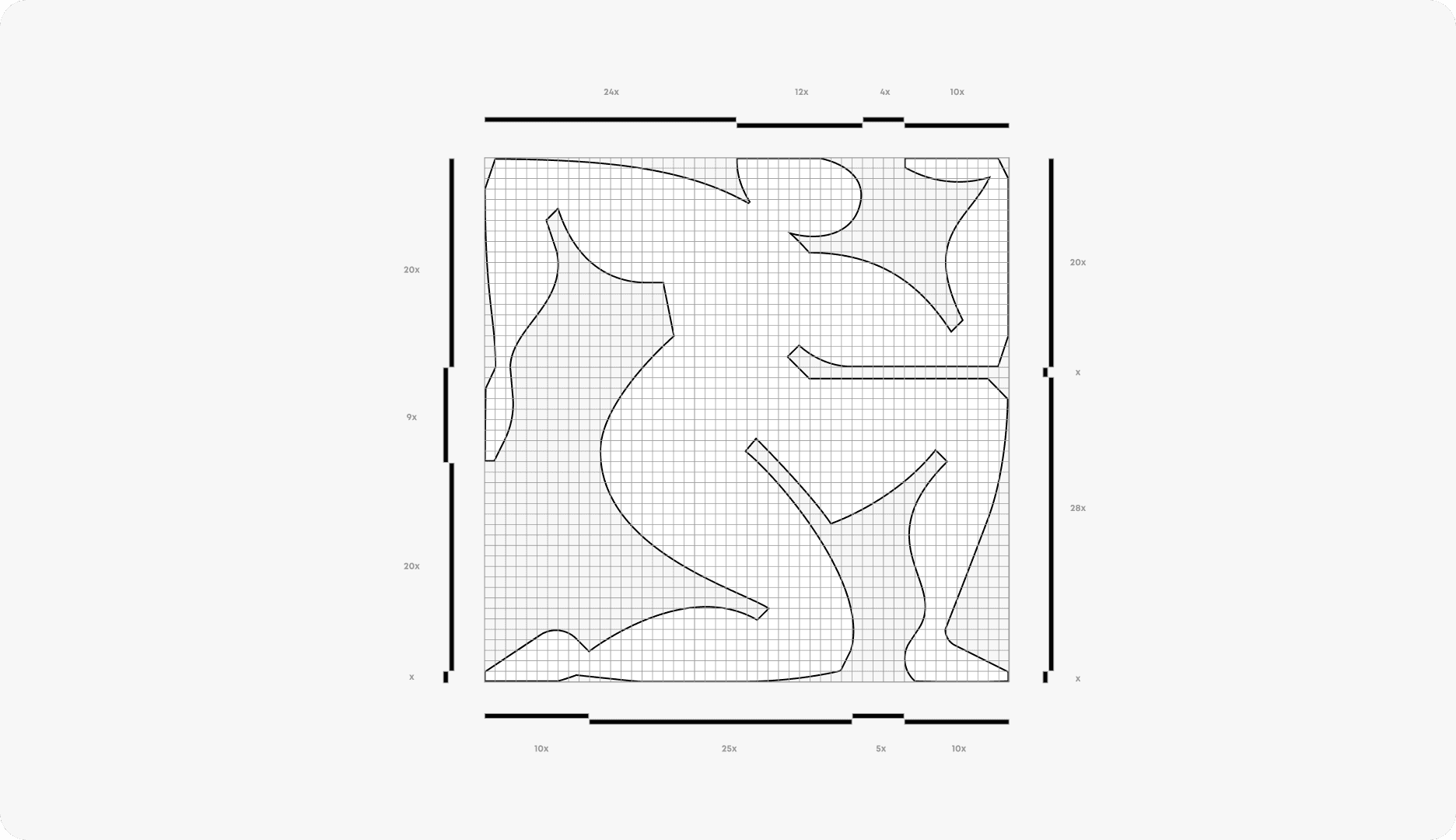
The new symbol reinterprets Atlas as a condensed geometric figure contained within a square structure. Inspired by ancient archetypes and reduced almost to a pictogram, the mark preserves the sense of burden, tension, and support, while becoming far more iconic and versatile.
Conceptually, Atlas is treated not simply as a mythological figure, but as an early proto-image of the superhuman: a being defined by strength, endurance, and an impossible burden. This idea becomes a metaphor for the human condition itself — for the invisible weight people carry and the resilience required to keep going.
The body was intentionally abstracted to avoid a hyper-masculine reading and to create a more inclusive symbol — one that can belong to anyone. Its softened yet powerful silhouette suggests effort and tension without becoming aggressive or illustrative.
The wider visual language follows the same principle: black and white create clarity and contrast, while tactile materials, sculptural applications, and minimal typography give the identity a grounded, serious, and timeless presence.
client
Свръхчовекът с Георги Ненов
industry
Podcast · Media · Education
Personal Growth
scope
Rebranding, Logo Design, Visual Identity,
Art Direction, Brand Applications
credits
Desislava Sredkova by Awblak




result
The result is a more focused and distinctive identity that keeps the emotional core of the original brand while elevating it into a more contemporary and symbolic system.
The new logo is simpler, more compact, and more adaptable across digital and physical touchpoints — from podcast platforms and merchandise to environmental graphics and editorial communication. Most importantly, it shifts the meaning of the brand away from visible force and toward inner strength.
Because being superhuman is not about appearing invincible. It is about carrying what is heavy, facing what is unseen, and continuing anyway.
year
2026
links
superhumanpodcast.bg
YOU MIGHT ALSO LIKE